

Football crests transcend mere logos; they embody a club’s soul, weaving tales of triumph, turmoil, and transformation.
For Real Madrid, more than a club, the crest mirrors Spain’s turbulent political history. From monarchy to republic to dictatorship and the team’s ascent to global dominance. Each redesign captures this interplay of power, prestige, and prowess on the pitch.
The crest has a very important duty: it represents the identity of the club and the millions who follow and support it. The crest of Real Madrid symbolises Royalty and holds many stories from major historical events, which have shaped the club over the decades.
The Royal Crown’s Enduring Symbolism
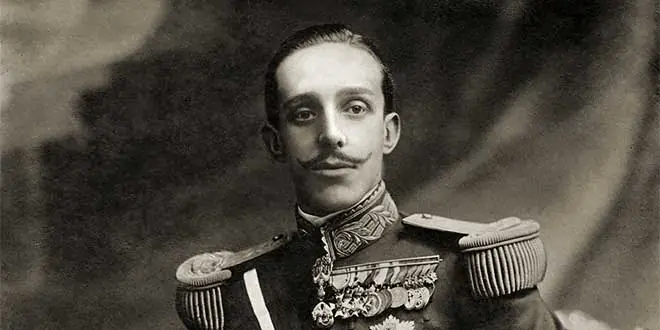
King Alfonso XIII’s 1920 gift bestowed prestige, authority, and patronage, crowning “MCF” without the “R” insertion, per President Pedro Parages’ fidelity to design. Removed in 1931, republican zeal, restored in 1941 under Franco, signifies resilience.
A royal echo persists through upheavals.
This toggle tracked Spain’s regime swings, bolstering Madrid’s elite aura during European conquests.
1902–1908: Minimalist Foundations

Real Madrid’s journey began humbly in 1902 as Madrid Club de Fútbol, its original crest a stark monogram of interlocking “MCF” initials in dark blue on white. This minimalist design, lacking flourish or frame, reflected the nascent club’s amateur roots amid Madrid’s emerging football scene.
The change stemmed from foundational simplicity. No royal ties or regional symbols burdened the badge, mirroring Spain’s pre-monarchical football era.
On the field, early success brewed: by 1905, Madrid FC claimed its first Spanish Cup, defeating Athletic Bilbao and signaling regional promise.
This crest’s endurance into 1908 underscored stability as the club professionalized, laying the groundwork for a structured identity.
1908–1920: Structured Circle Emerges

In 1908, the badge evolved into a circular frame with aligned “MCF” letters inside, outlined in dark blue on white, crisper, more emblematic.
The shift professionalized the look, aligning with the club’s growing organization post its 1909 role in founding the Spanish FA.
Politically neutral, it predated royal patronage, focusing on local pride. Football-wise, Madrid contended in nascent leagues, finishing runners-up in La Liga’s 1929 debut, honing dominance amid Spain’s unstable monarchy.
1920–1931: Crown of Royalty Added

King Alfonso XIII granted the “Real” title in 1920 for promoting Madrid globally, crowning the circular crest with a gold royal crown atop “MCF”-now denoting Real Madrid Club de Fútbol.
Usually regal, white dominated with blue outlines and gold accents, the crown symbolizes prestige without altering inner typography.
This royal nod elevated the status amid Alfonso’s patronage, intertwining the club with the monarchy. On pitch, it coincided with early league contention, culminating in 1931–32 and 1932–33 La Liga triumphs.
1931–1941: Republican Shift & Crown’s Removal

The Second Spanish Republic’s 1931 dawn stripped royal symbols; the crown vanished, “Real” dropped for “Madrid CF,” and a diagonal purple (mulberry) band sliced the circle, honoring Castile’s colors. Shape stayed circular, colors muted sans gold, typography simplified.
Politics dictated: anti-monarchist fervor erased royalty, purple asserting regional identity. Amid Civil War chaos, Madrid navigated survival, its
11–1 1943 Copa semi-final thrashing of Barcelona fueling controversy.
1941–1998: Crown Restored, Purple Retained
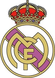
Franco’s victory in 1939 led to the 1941 crown reinstatement atop a purple-banded circle: gold crown detailed, white dominant, blue outlines, purple sash, bold “RMCF.”
Dictatorship revived royalty for unity; purple stayed cultural. Bernabéu era exploded: Di Stéfano’s five straight European Cups (1956–60) built a legend.
Dominance defined the postwar revival.
1998–2001: Blue Band Modernization
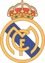
Lorenzo Sanz’s 1998 presidency shifted purple to blue post-Adidas deal, crown bolder, colors vibrant gold-blue-white, sharper for commercial appeal.
Global branding pushed tweaks; the 1998 UCL triumph and 2000 La Liga validated era. The 2001 centenary variant celebrated with stylized elements, bridging old and new.
2002–Present: Sleek Global Icon
![]()
Florentino Pérez’s 2002 redesign refined further: widened “M,” shortened blue band, raised crown off ring, 3D shading for digital sharpness—clean white, blue, gold.
Galácticos expansion (Figo, Zidane) demanded versatility; 15 UCLs seal supremacy.
Evolution prioritizes recognizability.
Conclusion
Japan Logo History
Which one’s your favorite? 👇 pic.twitter.com/TjZ6A9tknO
— Football Kit Archive (@footballkitarch) July 4, 2025
Real Madrid’s crest kept symbolizing an unbroken identity over the decades despite so many changes. It paralleled Madrid’s post-war revival and Yé-yé, Quinta del Buitre eras.
Real Madrid’s crest chronicles power’s ebb and flow, resilience amid Spain’s upheavals, from local upstart to 15-time Champions League kings. Evolving with the monarchy’s fall, the dictatorship’s grip, and globalization’s pull, it forges a legacy etched in white, gold, and purple. Today, this badge reigns as sport’s most potent emblem, uniting billions under its crowned gaze.