

Atlético Madrid is more than just a football club it represents passion, resilience, and deep-rooted identity within the city of Madrid. Known for its fighting spirit on the pitch, the club’s crest reflects exactly that: a blend of history, symbolism, and pride.
Every detail from the bear to the red-and-white stripes tells a story of where Atlético comes from and what it stands for.
Let’s break down the meaning behind Atlético Madrid’s iconic crest.
The Bear and the Strawberry Tree – Madrid’s Symbol
At the top of the crest, you’ll find a bear standing against a tree.
- Represents the official symbol of the city of Madrid
- The bear (El Oso) and the strawberry tree (Madroño) date back to medieval Madrid
- Connects Atlético directly to the city’s heritage
- Reinforces the club’s identity as Madrid’s people’s club
This symbol isn’t just decorative, it anchors the club firmly in its hometown.
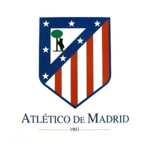
The Seven Stars – A Regional Identity
Surrounding the bear are seven white stars.
- Taken from the constellation Ursa Major
- Represent regions around Madrid like Toledo, Segovia, and Guadalajara
- Symbolize unity and regional pride
- Add a celestial, almost mythical dimension to the crest
These stars elevate the badge from local identity to something broader and symbolic.
The Red and White Stripes – The Colchoneros
The lower half of the crest features bold red and white vertical stripes.
- Reflect the club’s traditional home colors
- Inspired by early kits adopted in the early 1900s
- Gave Atlético the nickname “Los Colchoneros” (The Mattress Makers)
- Symbolize passion, intensity, and identity
These stripes are one of the most recognizable elements in world football.
The Shield Shape – Strength and Tradition
Atlético’s crest is designed as a shield.
- Represents strength, resilience, and defense
- Reflects the club’s hard-working, never-give-up mentality
- Maintains a classic football identity rather than a modern logo feel
The shape perfectly matches Atlético’s reputation as fighters on the pitch.
Evolution of the Crest – Tradition vs Modernity
The Atlético crest has evolved over time, but its core elements have remained.
- Early crest mirrored Athletic Bilbao due to shared origins
- 1917 introduced the bear, tree, stars, and stripes
- 2017 redesign modernized the look with cleaner lines
- 2024 saw a return to a more traditional version after fan demand
This evolution shows how deeply fans connect with the badge; it’s more than design; it’s identity.
Colors – Red, White, and Blue Identity
Atlético’s color palette is simple but powerful.
- Red & White: Passion, aggression, and energy
- Blue: Stability, loyalty, and heritage
- Reflects both club identity and historical roots
The balance of these colors gives Atlético a unique visual identity in football.
More Than Just a Crest
Atlético Madrid’s badge is a perfect reflection of the club itself:
- Deeply connected to its city
- Proud of its roots
- Built on resilience and fighting spirit
It’s not just a symbol it’s a statement of identity
Final Thoughts
While some clubs use their crests to represent dominance or legacy, Atlético Madrid’s badge tells a different story, one of struggle, pride, and belonging.It represents a club that doesn’t just play football but fights for every inch.
It reflects a spirit built on resilience, where identity is forged through adversity rather than ease. More than a symbol, it embodies the heartbeat of its fansunyielding, passionate, and forever defiant. Atlético Madrid’s crest is not just worn, it is lived.