

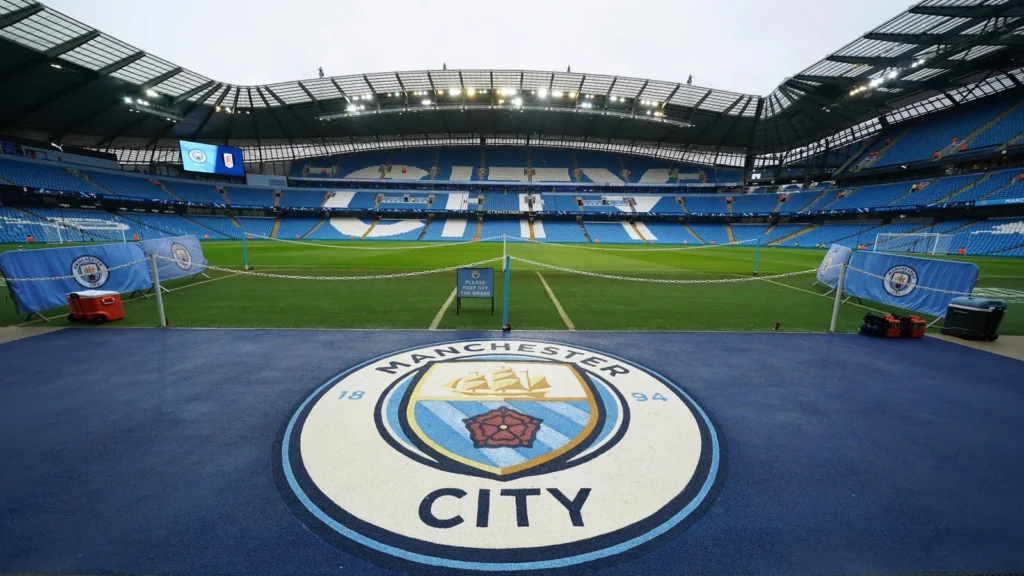
Manchester City isn’t just a modern football powerhouse it’s a club deeply rooted in the identity of its city. While their recent dominance under Pep Guardiola has brought global recognition, the crest itself tells a story that stretches far beyond trophies and titles.
Every element from the ship to the red rose connects Manchester City to its industrial past, cultural identity, and evolution as a football institution.
Let’s break down the meaning behind Manchester City’s iconic crest.
The Story Behind Manchester City’s Crest
What is Manchester City?
Manchester City F.C. is a professional football club based in Manchester, England. Founded in 1880 (as St. Mark’s), the club has transformed from a local team into one of the most dominant forces in world football.
But despite this modern success, the crest remains a tribute to the city’s heritage.
The Circular Badge – A Return to Tradition
Manchester City’s current crest, introduced in 2016, marked a return to a more traditional circular design something fans strongly supported.
- The circular shape mirrors older club badges used before the 1990s
- It reflects heritage and authenticity rather than modern corporate design
- The redesign was influenced heavily by fan feedback
- It symbolizes a reconnection with the club’s roots
This wasn’t just a rebrand, it was a statement of identity.
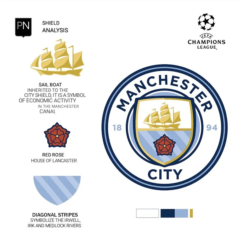
Why Manchester City’s crest has a ship on it?
At the top of the crest sits a golden ship, one of its most defining features.
- Represents the Manchester Ship Canal, a symbol of the city’s industrial power
- Highlights Manchester’s history as a global trading hub
- Connects the club to the working-class roots of the city
- Symbolizes progress, movement, and ambition
Just like Liverpool’s Liver bird reflects maritime heritage, City’s ship represents commerce and industry.

The Red Rose – A Symbol of Lancashire
At the center of the crest is the red rose.
- Represents the historic county of Lancashire
- Connects Manchester City to regional pride and identity
- A symbol of unity and tradition in English history
- Links the club to the broader cultural roots of Northern England
It’s a subtle but powerful reminder that the club belongs to something bigger than football.
The Year 1894 – A New Beginning
The number 1894 appears prominently on the crest.
- Marks the year the club officially became Manchester City
- Represents transformation and rebirth
- Honors the club’s journey from its early beginnings
- Acts as a bridge between past and present
It’s a nod to identity when the club truly became what we know today.
The Colors – Sky Blue Identity
Manchester City’s iconic sky blue dominates the badge.
- Represents the club’s traditional home colors
- Instantly recognizable worldwide
- Symbolizes calmness, control, and elegance
- Reflects the modern playing style under Guardiola
The color has become synonymous with City’s brand of football.
More Than Just a Crest
Manchester City’s badge isn’t just a design it’s a reflection of evolution.
- From a local Manchester club to a global football giant
- From industrial roots to modern dominance
- From tradition to innovation
While the club continues to break records on the pitch, the crest ensures its identity remains grounded in history.
Conclusion
Much like Liverpool’s crest tells a story of resilience and community, Manchester City’s badge is about progress, heritage, and transformation.
It reminds fans that no matter how modern football becomes, a club’s true identity will always lie in its roots.