

Football crests are more than mere logos; they embody a nation’s sporting soul, weaving together cultural heritage. The collective ambition and moments of triumph on the pitch.
Japan is currently the most developed nation in football in Asia. They consistently hold the number 1 ranking in Asia and the top 20 in the World Ranking. In the last three decades, they have developed a very promising grassroots and tier system for young players.
Japan, whose national team has risen from Asian underdogs to consistent World Cup contenders. The crest serves as a visual chronicle of transformation. Central to this story is the Yatagarasu, a three-legged crow from ancient mythology that has guided the Samurai Blue through decades of evolution. Symbolizing the sun’s guidance and unwavering national unity.
Origins of the Yatagarasu
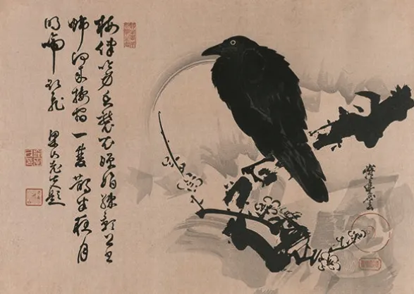
The Yatagarasu draws from Shinto mythology, appearing in texts like the Nihon Shoki. It is a divine bird dispatched by the sun goddess Amaterasu to lead Emperor Jimmu across treacherous terrain to Yamato, the heartland of ancient Japan.
This three-legged crow represents guidance through darkness, the life-giving sun, and celestial favor. Qualities that resonate deeply with a football federation seeking direction amid post-war rebuilding.
Adopted by the Japan Football Association (JFA) in 1931, shortly after its founding as the Greater Japan Football Association, the Yatagarasu became an instant emblem of aspiration. Its endurance across nearly a century of redesigns underscores its role as a cultural anchor, immune to fleeting trends, as Japan professionalized its game and chased global relevance.
1931–1988: The Foundational Symbol
From 1931 to 1988, the JFA’s identity centered on a straightforward depiction of the Yatagarasu clutching a football. Often rendered in stark red against a white background or integrated with the national flag outlined in red, with “JFA” in black at the lower left.
This minimalist design reflected Japan’s nascent football scene, dominated by amateur university teams and hampered by disruptions during World War II. The change was cultural at its core: the crow embodied resilience and divine navigation, fitting for a sport re-emerging in a nation focused on economic recovery.
Though Japan struggled internationally, failing to qualify for major tournaments, the symbol laid groundwork for unity, culminating in the 1988 Asian Cup campaign. Where the team reached the quarterfinals, signaling readiness for bolder branding.
This era transitioned smoothly as football professionalized. The launch of the J.League in 1993 demanded a more polished identity, prompting the JFA to evolve without abandoning its roots.
1988–1991: Circular Badge Era
![]()
In 1988, the Yatagarasu appeared on a vibrant yellow circle with a blue outline, encircled by the full “JAPAN FOOTBALL ASSOCIATION” text in bold lettering. The shift from flag-based simplicity to this circular format marked Japan’s entry into modern federation aesthetics, influenced by global standards.
The upcoming Asian Cup success that year, where they finished fourth. Colors evoked the rising sun-yellow for dawn, blue for the sky, while the crow’s prominent position holding the ball emphasized sport over pure mythology. This design bridged amateur past and professional future, aligning with J.League preparations and heightened domestic fervor.
1991–1996: Shield-Style Introduction
By 1991, the emblem adopted a white shield with a central vertical red stripe, the Yatagarasu perched atop a football within it, flanked by “JFA” in distinctive green Gothic typography. The shield shape conveyed strength and defense, a nod to tactical discipline, while the Gothic font added European flair amid globalization.
Driven by J.League’s 1993 debut and preparations for the 1998 World Cup qualifiers, this redesign professionalized the look for TV broadcasts and merchandise. It coincided with Japan’s first World Cup qualification in 1998, under coach Hiroshi Nanami, marking their debut on the global stage and fueling the “Samurai Blue” moniker for resilient play.
1996–2010: Refinement Amid Rise
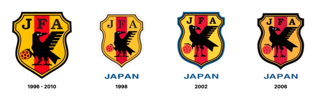
Refined in 1996, the shield grew more intricate with curved edges. The Yatagarasu’s ball gains white details for depth, and “JFA” in a sleeker typeface sans the explicit “Japan” text. Red, white, and subtle golds dominated, simplifying for scalability on jerseys during high-stakes eras.
This iteration reflected Japan’s ascent: co-hosting the 2002 World Cup with South Korea, reaching the knockout stage, and winning Asian Cups in 2000 and 2004. The changes stemmed from branding needs for international exposure, as JFA invested in youth academies and technical evolution, mirroring the team’s disciplined, possession-based style.
2010–2017: Modern Simplification

The 2010 crest streamlined further: a cleaner shield, reduced crow details, and minimalist lines for digital versatility. Retaining the red stripe but softening edges. This modernization aligned with FIFA’s branding guidelines and Japan’s 2011 Asian Cup triumph on home soil.
Prompted by corporate sponsorships and social media growth, it emphasized accessibility while tying to milestones like the 2010 World Cup Round of 16 exit, where Keisuke Honda’s emergence symbolized a new generation’s poise.
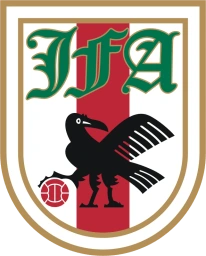
2017–Present: Gold-Trimmed Rebrand
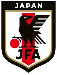
In 2017, the JFA unveiled its current crest: a minimalist shield with gold trim, black outline, the Yatagarasu over a solid red ball, “Japan” arched above, and “JFA” below—all on white with the red stripe.
This rebrand, part of the “JFA 2005 Declaration” toward 2050 goals, sharpened focus for a tech-savvy audience. It supported the Samurai Blue’s resurgence – 2018 World Cup Round of 16, 2022’s dramatic Germany upset. And the reinforced unity post-2011 earthquake. The gold evoked imperial heritage, signaling maturity as Japan eyes World Cup glory
Conclusion
Japan Logo History
Which one’s your favorite? 👇 pic.twitter.com/TjZ6A9tknO
— Football Kit Archive (@footballkitarch) July 4, 2025
Japan’s football crest has evolved through shapes, colors, and typography. From the minimalist 1931 roots to the sleek 2017 gold-trimmed shield, the Yatagarasu’s essence of divine guidance, rising-sun resilience, and national unity has endured unchanged across nearly a century.
This steadfast core mirrors the Samurai Blue’s disciplined ascent, blending ancient myth with modern triumphs like World Cup knockouts and Asian Cup glories. As Japan eyes future silverware, the crow’s timeless vigil promises continued evolution rooted in unshakeable identity.