

Chelsea FC is a professional football club based in London, competing in the Premier League, the top tier of English football. Founded in 1905, the club has become one of England’s most successful teams, recognised for its domestic and European triumphs and high-profile global following.
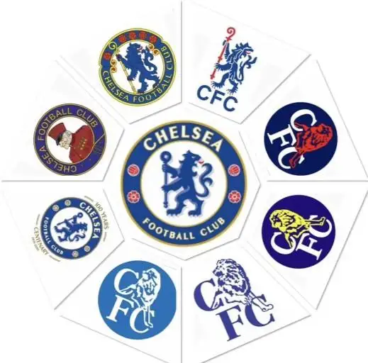
Over the years, that identity has been shaped not only by results on the pitch but also by the symbols associated with the club. Like many historic teams, Chelsea’s crest reflects more than design, it represents heritage, place, and evolution.
Understanding how that crest has changed over time offers insight into how the club itself has grown, adapted, and defined its image across different eras.
“The Story Behind Chelsea’s Iconic Crest:
1905–1952: The Pensioner Era :
When Chelsea were founded, their identity was built around the image of a Chelsea Pensioner, a retired soldier from the nearby Royal Hospital.
This symbol gave the club its early nickname, “The Pensioners.”
However, the crest was rarely used on kits and reflected a more traditional, almost institutional identity. At a time when many clubs were still defining themselves, this emblem tied Chelsea closely to its local surroundings. While it lacked broader appeal, it established an early sense of place something that would remain important in later redesigns.
1952–1953: A Shift in Identity :
With manager Ted Drake aiming to modernise the club, Chelsea briefly adopted a simple “CFC” monogram.
This marked a clear break from the past, a move toward a cleaner, more contemporary image, even if it was only temporary. The change reflected a growing awareness of image and presentation within football. Although short-lived, it signalled the club’s willingness to move away from outdated symbols in favour of a more modern identity.
1953–1986: The Lion is Born :

This period introduced the defining feature of Chelsea’s identity, the lion holding a staff.
Inspired by local heraldry and the Earl Cadogan’s coat of arms, the crest also included red roses and footballs, blending national symbolism with sporting identity.
For the first time, Chelsea had a crest that felt complete, one that would become deeply associated with the club’s rise.
This redesign gave Chelsea a visual identity that felt both traditional and distinctive. For the first time, the crest carried a balance of local heritage and broader recognition, helping establish a symbol that supporters could strongly identify with.
1986–2005: Modernisation and Commercial Era :
In 1986, Chelsea introduced a more modern, simplified crest, featuring a stylised lion alongside the initials “CFC.”
This redesign reflected the changing nature of football, where branding and commercial appeal became increasingly important. The shift aligned with a wider trend across football, as clubs began adapting their identities for marketing and global audiences. While effective in that sense, it marked a departure from the traditional design language that had previously defined Chelsea.
While effective in a modern context, the design moved away from traditional elements, creating a disconnect for some supporters.
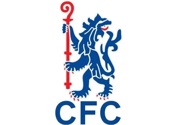
2005–Present: A Return to Tradition :
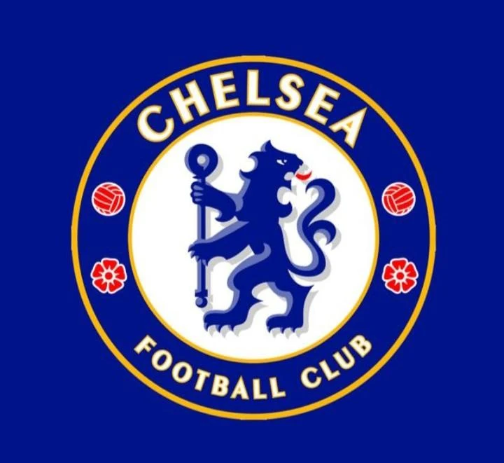
To mark their centenary, Chelsea reintroduced a crest inspired by the 1953 design, restoring the circular badge, heraldic lion, roses, and footballs. This version balances tradition with clarity, becoming one of the most recognisable crests in world football.
Rather than creating something entirely new, the club chose to reconnect with its past. That decision reflects a broader shift in football, where heritage has regained importance alongside modern branding.
What Does the Lion Represent?
At the centre of Chelsea’s crest stands a lion rampant regardant holding a staff, a symbol rooted in West London’s history.
The lion is derived from the coat of arms of the Earl Cadogan, a key figure in the area’s development, while the staff represents authority and tradition.
Rather than being purely decorative, the lion reflects strength, identity, and a connection to the club’s origins.
Roses and Footballs: Tradition and Identity
The surrounding elements are deliberate. The red roses reflect England’s national identity, while the footballs reinforce the club’s sporting purpose.
Even as the crest has evolved, these symbols highlight a consistent approach, prioritising recognisable identity over abstraction.
“The evolution of Chelsea FC’s crest through the years.”
The Enduring Appeal of Chelsea’s Crest :
The crest of Chelsea FC remains instantly recognisable, not because it has remained unchanged, but because it has evolved without losing its core identity.
Over time, it has come to represent more than just a club badge. For supporters, it carries a sense of continuity, linking different eras, players, and achievements through a single visual identity. Even as football has become increasingly commercialised, Chelsea’s crest has retained a connection to its origins.
That balance between tradition and modern relevance is what gives it lasting appeal, not just as a design, but as a symbol of the club itself.
Conclusion :
Chelsea’s crest is more than a design. It is a reflection of history, identity, and continuity.
As the club has evolved, the lion has remained, not just as a symbol, but as a constant link between past and present.
In a changing game, that continuity gives it lasting meaning, not just as a badge, but as an identity.