Behind the Crest is a series where we unravel the story behind Football’s unique crests.
Ajax Amsterdam, one of Europe’s most iconic football clubs, has always had a rich history intertwined with its emblem.
Known for its attacking football and legendary players, Ajax has now decided to bring back its classic logo from the 1928-1991 era starting the 2025/26 season.
This decision isn’t just about aesthetics—it’s about nostalgia, fan loyalty, and celebrating a legacy.
Let’s dive into the history of Ajax’s crest and why the club is returning to its roots.
The Story Behind Ajax’s Crest
What is Ajax?

Founded in 1900, Ajax is one of the most successful and storied clubs in football history. Based in Amsterdam, Netherlands.
The club takes its name from the ancient Greek hero Ajax, a towering figure from Homer’s Iliad.
Known for his incredible strength, courage, and loyalty, Ajax was one of the greatest warriors in the Trojan War.
This connection to the Greek hero embodies the values of determination, resilience, and greatness that the club aspires to on and off the field.
The club’s crest, like its playing style, has evolved over time, but it has always drawn inspiration from its namesake, symbolizing the heroic qualities that define Ajax’s identity and values.
The history of Ajax’s Crest
1900–1911: The Beginning

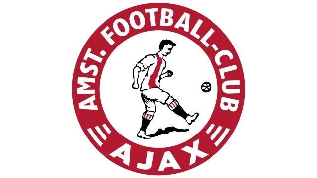
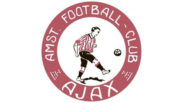
When Ajax was founded in 1900, the club introduced its first crest.
This emblem featured a simple depiction of a footballer dressed in the club’s original kit: a white shirt with red vertical stripes and black shorts.
Surrounding the player was a circle with the words “Amst. Football-Club Ajax”. A football was also included to symbolize the sport.
At the time, it was rare for clubs to have official logos. Ajax stood out by creating an emblem that connected to its roots in Amsterdam and the game itself.
1911–1928: Redefining Identity

In 1911, Ajax updated its logo after achieving promotion to the Eerste Klasse, the top division in Dutch football.
This redesign also coincided with a kit change. To differentiate themselves from Sparta Rotterdam, Ajax adopted a white shirt with a bold red vertical stripe down the center and white shorts.
The logo reflected these changes, incorporating the brighter red shade and new uniform design.
This period marked Ajax’s first steps towards establishing a distinct visual identity.
1928–1991: The Classic Crest is Born

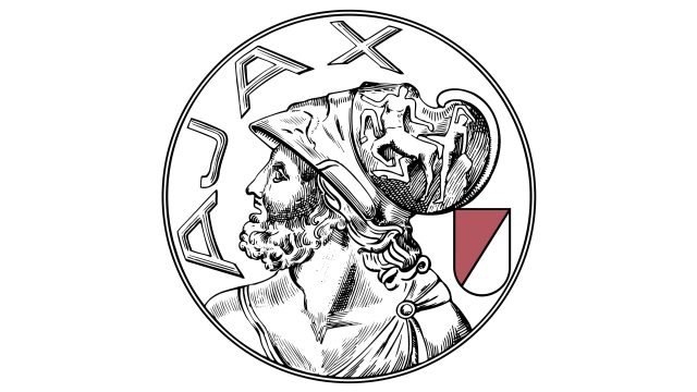
In 1928, Ajax introduced the logo that would become synonymous with the club’s golden era. Inspired by the Greek hero Ajax, the emblem featured a detailed portrait of the mythological figure, drawn in profile.
The design was enclosed in a double-ring frame, with the club’s name “Ajax” on the left and the club’s colors—red and white—on the right.
This crest symbolized strength, resilience, and a connection to classical mythology.
It adorned Ajax kits during their rise to European prominence, including their first European Cup win in 1971.
For 62 years, this emblem represented Ajax through thick and thin. However, by the early 1990s, the design was deemed too complex for modern branding needs.
1991–Today: Minimalism Takes Over

In 1991, Ajax embraced a more abstract and minimalist logo. The detailed portrait of Ajax was replaced by a modern outline made up of 11 lines, representing the 11 players on a football field.
The new crest also removed the black and white shield from the earlier design, focusing solely on the simplified portrait and the club’s name, Ajax Amsterdam.
While this logo was clean and easy to reproduce, it lacked the emotional resonance of the previous crest.
Over the years, many fans expressed a longing for the classic emblem, associating it with Ajax’s legendary triumphs.
2025 and Beyond : The return of the classic crest

The return of the classic crest is more than just a design change—it’s a celebration of Ajax’s legacy.
From the youth academy to the first team, the emblem will now represent 125 years of passion, innovation, and excellence.
Fans will once again see the mythological hero Ajax proudly displayed on their team’s kits, a reminder of the club’s enduring spirit and commitment to its roots.
Why is Ajax Bringing Back the Classic Crest?
The return of the classic crest in 2025 coincides with Ajax’s 125th anniversary celebrations.
This milestone presented the perfect opportunity to honor the club’s heritage and fulfill the long-standing wishes of its fans.
Fan Demand
For years, Ajax supporters have clamored for the return of the 1928-1991 logo.
The classic crest is deeply embedded in Ajax folklore, representing an era of dominance and unparalleled success.
According to Ajax CEO Menno Geelen:
“We know that the majority of our fans have cherished this wish for years. Our 125th anniversary felt like the perfect moment to give back the classic logo to our fans and ourselves.”
Honoring Legacy
The classic logo symbolizes Ajax’s glorious past, including their three consecutive European Cups from 1971 to 1973.
By reinstating this emblem, the club is embracing its history while looking forward to the future.
125th Anniversary Celebrations
The reintroduction of the crest was officially announced during a special Legends match on November 17, 2024, at the Johan Cruijff ArenA. Ajax Legends faced Real Madrid Legends in a thrilling game, which Ajax won 2-1, further adding to the celebratory atmosphere.
Starting in the 2025/26 season, the classic logo will once again feature on Ajax’s match shirts, bringing back a sense of nostalgia for fans.
Conclusion
Ajax’s decision to bring back their classic logo is a heartfelt nod to their history and supporters.
Over the decades, the club has evolved both on and off the pitch, but the classic crest remains a timeless symbol of Ajax’s identity.
As the club celebrates its 125th anniversary, this iconic emblem will serve as a bridge between Ajax’s illustrious past and its bright future.
Fans around the world can look forward to seeing their beloved crest back where it belongs—on the shirts of their heroes.
Ajax’s return to their roots proves that sometimes, looking back is the best way to move forward.


